

Redefining the way customers explore and purchase Samsung products
JUL - OCT 2021
JULY

PROBLEM:
SHOPPERS FAIL TO MAKE IT THROUGH THE PURCHASE PROCESS
The Virtual Store’s experience is designed for the business, not users. As a result, the paths to research and purchase are cluttered, confusing, and broken. Conversion is much lower than the industry standard.
THE CHALLENGE &OPPORTUNITY
RE-DESIGN SAMSUNG’S VIRTUAL STORE TO IMPROVE ITS METRICS
Virtual Store launched in Q4 2020 received favourably by businesses and consumers.
Clients would like now to enhance its features to improve its metrics
Our challenge was to research, strategize and design enhancements to bring the best of the in-store TV & Audio shopping experience to Samsung.com. This online experience is intended to help mid-funnel shoppers narrow their choices, and step up to more premium TV & Audio products while driving conversion. Below are some of the metrics that was shared.
USER DROP-OFF WAS AVERAGING 45%
ONLY 3% OF USERS ENGAGED WITH FEATURE MODULES ON PRODUCT PAGES
ADD TO CART RATE WAS ONLY 5%
For confidentiality reasons I have omitted the actual values for these metrics.
CURRENT EXPERIENCE FEELS DISCONNECTED AND MESSY
We want shoppers to have the best experience in the virtual store. They have shared with us their experience and impressions of the store..
“The role/purpose of the site is not clear, I don't feel like it is designed for commerce”
“The information provided for the Collections focused primarily on picture quality, but it neglected my needs n for additional features & criteria”
“My mobile experience is not optimised, as my primary intentions is research and comparison”
I STARTED OFF THIS PROJECT BY FORMING MY OWN POINT OF VIEW ON WHAT WAS GOING WRONG
OVERALL I FOUND
3 MAJOR ISSUES
WITH THE SITE
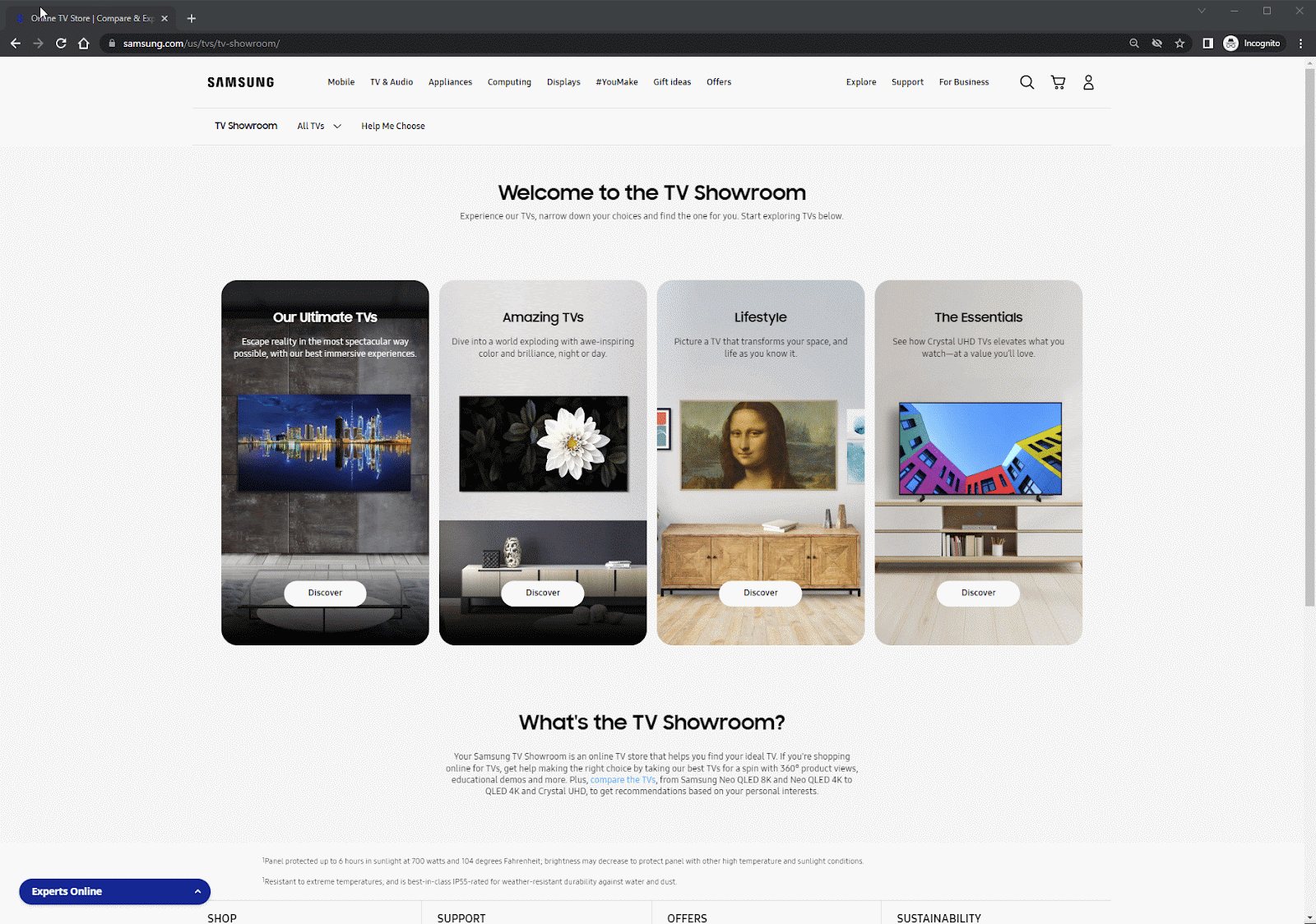
Virtual Store’s homepage & product pages are visually impressive and great for first-time users who are exploring what SAMSUNG has to offer.
However, it is poorly optimised for the conversion of mid-funnel shoppers whose objectives are to research and be convinced to upgrade to premium TVs.
A.
B.
C.
D.
Visibility of specifically which TV/collection is low, this may lead to confusion for new users
Homepage TV Showroom does not give any valuable information to users
No navigation tool for users to select a collection/product quickly
There's no information on the USP of the TV that makes it ‘premium’

A
B

C
D
ISSUE 1:
SITE NOT BEING USEFUL IN HELPING USERS COMPLETE THEIR OBJECTIVES
A
C
B
ISSUE 2:
USABILITY
Virtual Store’s homepage & product layout is clean and minimal however it has too much copy, there is a lack of visuals to aid and reduce the conductive load and information fatigue of users. Lack of iconography / visuals makes USP of TVs not memorable.
A.
B.
C.
No global navigation tool to select the desired collection if you are a returning user Shortcuts — hidden from novice users — may speed up the interaction for the expert user such that the design can cater to both inexperienced and experienced users. Allow users to tailor frequent actions.
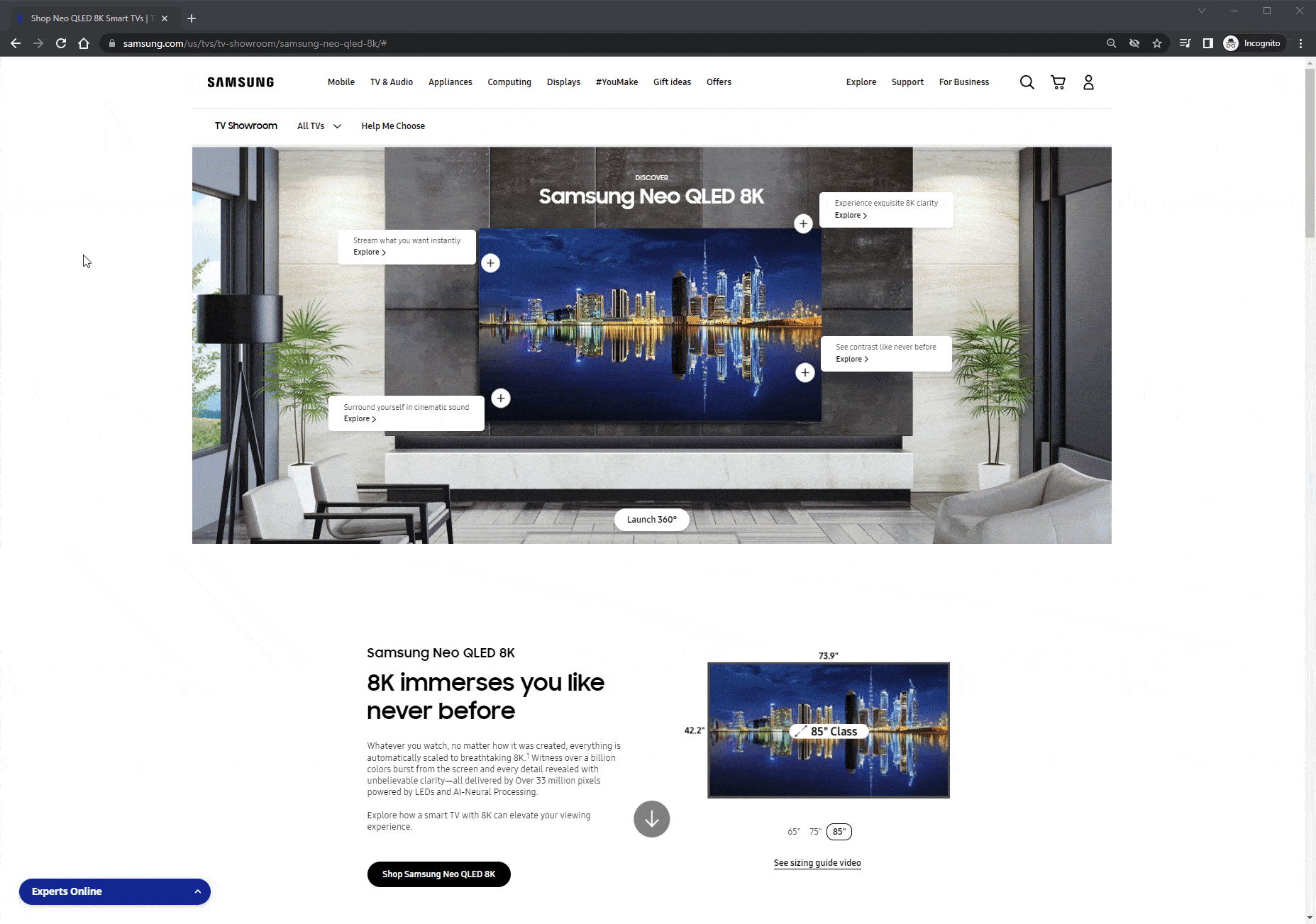
Although the 3D interaction is novel and interesting, the TV interaction takes quite long to load, which will frustrate users
Ease of use on the product page is low, too many features/ interactions, CTAs and copy. First-time users might not be able to accomplish basic tasks the first time they encounter the design
ISSUE 1:
SITE NOT BEING USEFUL IN HELPING USERS COMPLETE THEIR OBJECTIVES
ISSUE 3:
MISSING FEATURES
Virtual Store’s home page’s carousel interaction is novel and immersive but it is missing some key features that could convert and convince mid-funnel users.
A.
B.
C.
Although the 3D interaction was novel and interesting, load times are inconsistent, and the visual design of the page is very copy heavy
There is no information for key features/ specifications in plain sight, features were only on the quality of TV/colour
It is difficult to compare the differences IN the TVs in the same collection
B
A
C
USABILITY TESTING
UNDERSTANDING SHOPPER'S THOUGHT, BEHAVIOURS & FEELINGS WERE KEY
I wanted to confirm that my own point of view was correct. I ran usability studies/interviews.

USABILITY TESTING
KEY TAKEAWAYS & RECOMMENDATIONS TO IMPROVE
During the usability tests/ interviews, I confirmed 2 of the issues were significant and found 1 more major issue!

Improve navigation and page orientation usability issues to reduce overall friction
.png)
Better integrate the content & tools in the Virtual Store with the rest of the CTV pages in the CEJ to allow for a more natural & timely discovery
.png)
Give more emphasis to other notable features/technology rather than focusing solely on picture quality
INITIAL PUSHBACK FROM THE CLIENTS
During our presentations to the clients, the Usability studies served multiple purposes. The most obvious benefit is to figure out how to best address user needs, by identifying those design elements that do or do not work.
However, an equally powerful, and often neglected, benefit to usability testing is consensus building. Usability studies are a persuasion tool.
The clients were resistant to the change initially, but the usability studies helped to create camaraderie, manage expectations and most importantly it helped to build trust with our team. What impressed the clients was the reworked customer journey & design strategy targeting their behaviours
DESIGN
MY NEW DESIGN PRINCIPLES FOR THIS SITE
.png)
.png)
.png)
Improve usability specifically in readability, navigation and visual hierarchy
Minimalistic design & making sure that the user journey and navigation are memorable for returning users to be easily used
Optimising interactive features and content to aid users in their purchasing journey and proceed to add to cart

DESIGN
SAMSUNG VIRTUAL STORE HOMEPAGE
The Initial designs were immersive and impressive but they were catered toward new users who are exploring and browsing. As the objective now is to focus on mid-funnel users and convert them.
I have re-designed the navigation of the page from a carousel to cards to reduce the number of actions needed for users to select their interested TV. Users are now able to view a variety of TVs on the homepage.
Before
After


.png)

VIRTUAL STORE PROTOTYPE

DESIGN
SAMSUNG VIRTUAL STORE HOMEPAGE (INITIAL EXPLORATION DESIGNS)
I decided to use option 2’s card layout without the animated introduction & vertical navigation menu. Although many of the options were visually appealing, I had to focus on reducing website load time, and interaction cost and driving mid-funnel users to explore the TV collections and add to the cart and I managed to save precious time by working closely with developers to get their insight whether each option would be feasible to code & if it could align with our desired timeline.
.jpg)
Option 1

Option 4

Option 2
.jpg)
Option 5
.jpg)
Option 3
.png)
Option 6
DESIGN
SAMSUNG VIRTUAL STORE
COLLECTION & PRODUCT PAGE
Introduced hotspots to encourage shoppers to click.
Redesigned the layout of the page to increase readability and usability.
Introduced comparison table with a simple/advanced specs switches and awards section.
I chose to reduce the copy and visual elements on the upper fold and go for a minimalistic look. The previous design had way too elements and CTAs all screaming at you for attention.
Before
.png)
.png)
After


DESIGN
SAMSUNG VIRTUAL STORE COLLECTION & PRODUCT PAGE (HOTSPOTS)
The objective going into redesigning the interactive features was that I needed to improve the engagement rate of the interactive features tool.
I decided to use hotspots believing that it will increase the feature visibility and engagement rate, the design for the features in the old product page was low in visibility and required users to click on the hotspots to interact with them, some users might miss the feature tool completely.
.jpg)
Version 1
.png)
Version 2
Final Version

DESIGN
SAMSUNG VIRTUAL STORE COLLECTION & PRODUCT PAGE (HOTSPOTS, CHOOSING WHAT INTERACTIONS TO FEATURE)
Samsung had a huge array of interactive features (below are a few examples). I chose Option 1 videos as the main interactions for the hotspots because they would provide the most value to mid-funnel shoppers researching a premium TV. I excluded the rest of the interactive feature options in the final design as I did not want to overload the shoppers with interaction options.
.jpg)
.jpg)
Option 1 videos
.jpg)
Option 2 Custom Bezels
.jpg)
.jpg)
Option 4 Art mode
Option 3 Brightness Sensors

DESIGN
SAMSUNG VIRTUAL STORE COLLECTION & PRODUCT PAGE (COMPARISON TABLE)
Initial Designs did not have a section on the product page to compare features/specifications, you had to click away from the page to open up a comparison tool to view the selected products side-by-side.
I found that experience extremely cumbersome, hence my decision to include this table to compare products on the same page. To cater for the different behaviours or objectives of the users, I added a button to switch between simple to complex definitions for the specs.
.png)
.png)
DESIGN
SAMSUNG VIRTUAL STORE COLLECTION & PRODUCT PAGE (COMPARISON TABLE INITIAL DESIGNS)
I chose option 2 as it was the most readable and minimalistic in design.
.jpg)
.png)
.jpg)
Option 1
Option 2
Option 3

DESIGN
SAMSUNG VIRTUAL STORE
'HELP ME CHOOSE TOOL'
Shoppers prefer to be visually stimulated, hence I have replaced the pills with only copy more engaging visuals.
Optimised number of questions required as there were too many to pick from the previous design.
Used data and learnings from usability studies to optimise potential pain points.
Before
.png)
After


DESIGN
SAMSUNG VIRTUAL STORE
'HELP ME CHOOSE TOOL' INITIAL DESIGNS
As I explored a few variations the help me choose tool, I kept in mind the behaviours and preferences of mid-funnel customers, i.e function of the tv, distance of the TV/ size, and special features. I chose option 3 as it would be the most effective in helping users to be suggested a TV and the layout being the most readable. Although option 1 has features more customisable it would take too much effort to be recommended a TV.
.jpg)
.jpg)
.jpg)
.jpg)
.jpg)
Option 1
.png)
Option 2
.png)
Option 3
THE IMPACT
POSITIVE RESULTS BUT MUCH MORE TO DO
The redesign of the virtual store, product pages, and compare & 'help me choose' tool had a positive impact on the shopping experience. However, due to how transactional users' behaviour has been changing (amazon + Instagram shopping), I believe this to be a behaviour change that will reveal over a longer period of time and we would need to monitor closely
DECREASED USER DROP-OFF BY 13%
FEATURE MODULES ON PRODUCT PAGES ENGAGEMENT RATE INCREASED BY 15%
ADD TO CART RATE INCREASED BY 11%
For confidentiality reasons I have omitted the actual values for these metrics.

.png)
WE WON THE
BEST TV WEBSITE AWARD 2021